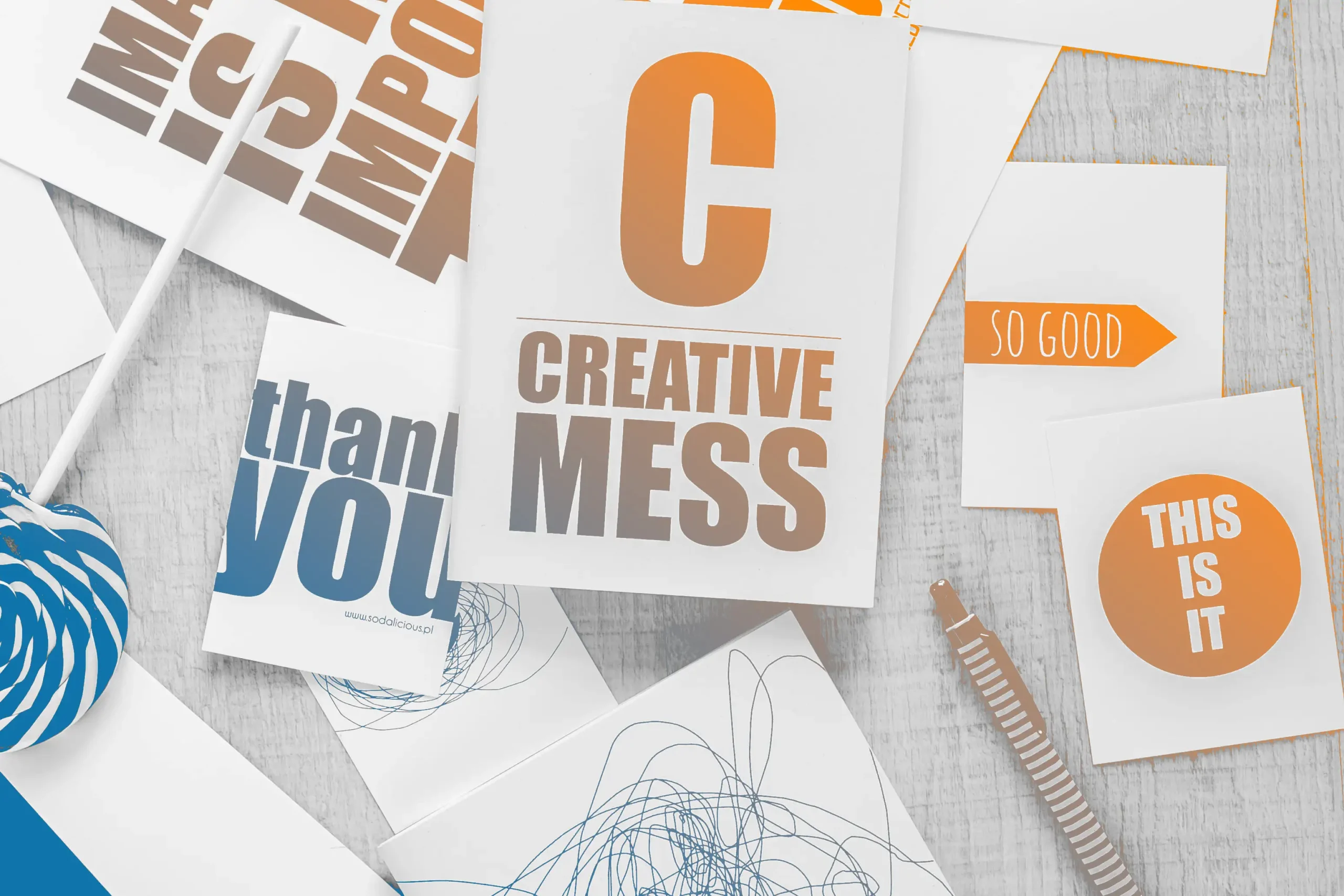
Typography is often underestimated in web design, quietly working behind the scenes while colours, images, and layout take centre stage. But in truth, typography is the invisible force that shapes how users experience and understand content. When done well, it can guide the reader’s eye, set the tone of a website, and even influence user behaviour. When ignored, it can create confusion, fatigue, and frustration – no matter how beautiful the rest of the site may be.
At its core, typography is about communication. It’s not just about choosing a font that “looks good” – it’s about making sure the message is delivered clearly and effectively. The right typeface can express professionalism, playfulness, elegance, or innovation. Think of a legal firm’s website. Would you trust it as much if it used Comic Sans instead of a sleek serif font? Probably not. Typography sends subtle signals that help users decide what kind of site they’re on and whether they can trust it.
Readability is another critical aspect. On the web, users scan more than they read. They want to get the information they need as quickly and effortlessly as possible. Good typography eases that process. Appropriate line height, font size, spacing, and contrast all contribute to how readable and scannable a webpage is. Poor typography, on the other hand, can feel like trying to read through fog – frustrating and exhausting.
Beyond readability, typography adds rhythm and hierarchy to a page. Headlines, subheadings, body text, pull quotes – they all play different roles, and typography helps assign each one its proper place. It creates a visual structure that helps users navigate content without even thinking about it. A well-designed typographic hierarchy guides the eye naturally, from most important to least, keeping users engaged and on track.
Then there’s the emotional side of typography. Fonts carry personality. A script font might feel romantic or personal, while a geometric sans-serif can seem clean and modern. These emotional cues can make a huge difference in how users feel about a brand. A website for a children’s toy store, for example, might use rounded, playful typefaces to evoke joy and friendliness, while a luxury fashion brand would go for sleek, high-contrast fonts to evoke elegance and exclusivity. In this way, typography becomes a storyteller, adding nuance and depth to the visual narrative.
